Logi Light specializes in designing specialized lighting for individual orders. Beyond the design itself, it supports clients throughout the entire implementation process: from selecting technology, through finding the right manufacturer, to ordering and delivering ready-made solutions.
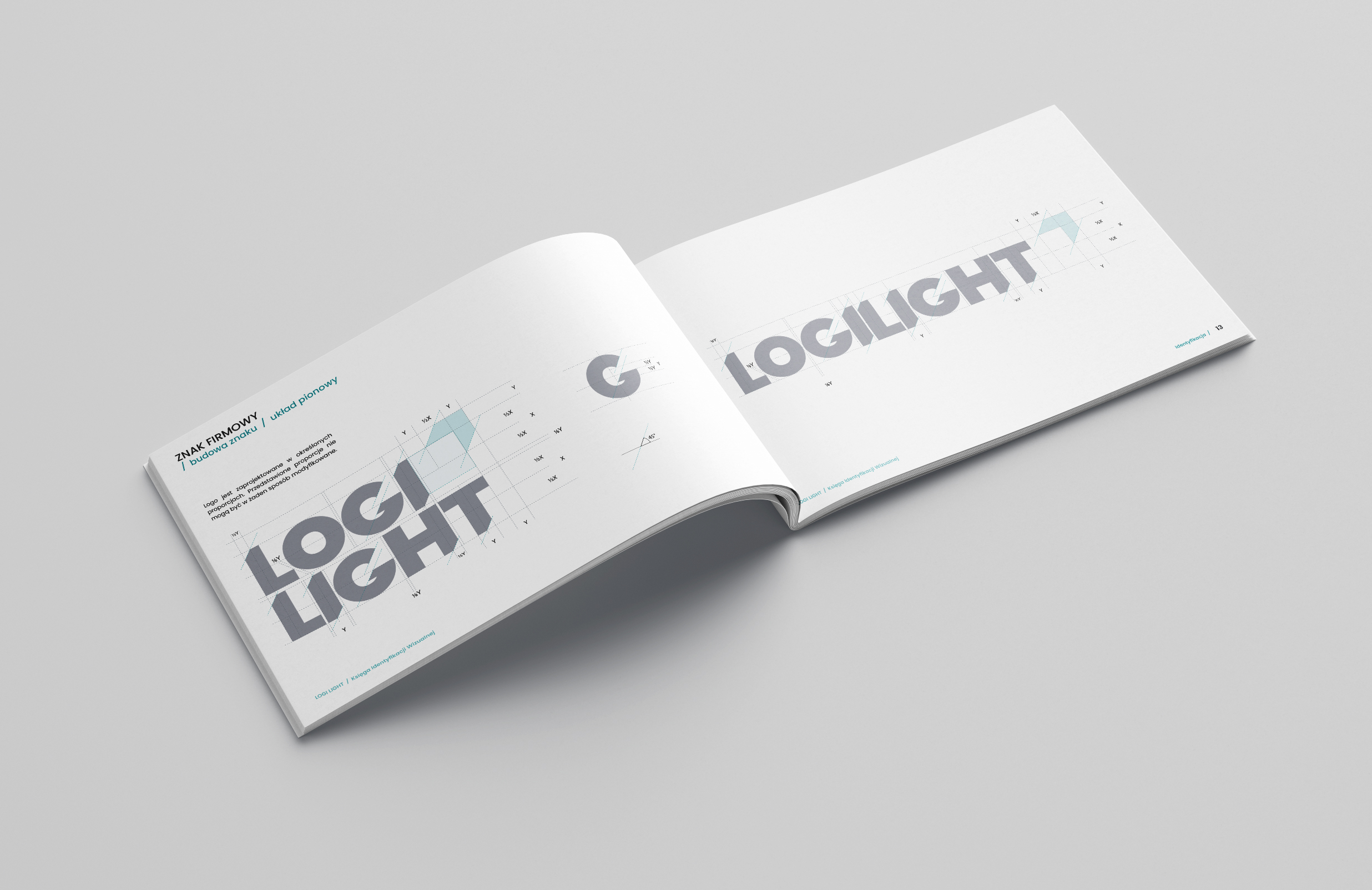
The logo was designed to be simple and clear, with a slightly technical feel that emphasizes the precision and operational nature of the brand. The central element of the logo is an arrow pointing upwards and to the right—a symbol of development, direction, and movement. It refers not only to progress but also to logistics: guiding a project along the right path, coordinating processes, and effectively moving an idea from concept to final implementation. The minimalist form allows the logo to maintain a modern, professional character and function well in a variety of contexts.
Working on the logo
The logo design process encompassed several conceptual approaches, varying in technicality, symbolism, and the way it evoked light and logistics. The presented versions illustrate the stages of research and design decisions—from more literal references to the industry to simplified symbols based on geometry and movement.
The goal of the process was to find a form that was both functional, memorable, and consistent with the company’s identity. The final choice was the result of a process of selection and refinement of the approach that best reflected the brand’s approach: a clearly defined goal, technical precision, and effective project completion.


Visual identification system
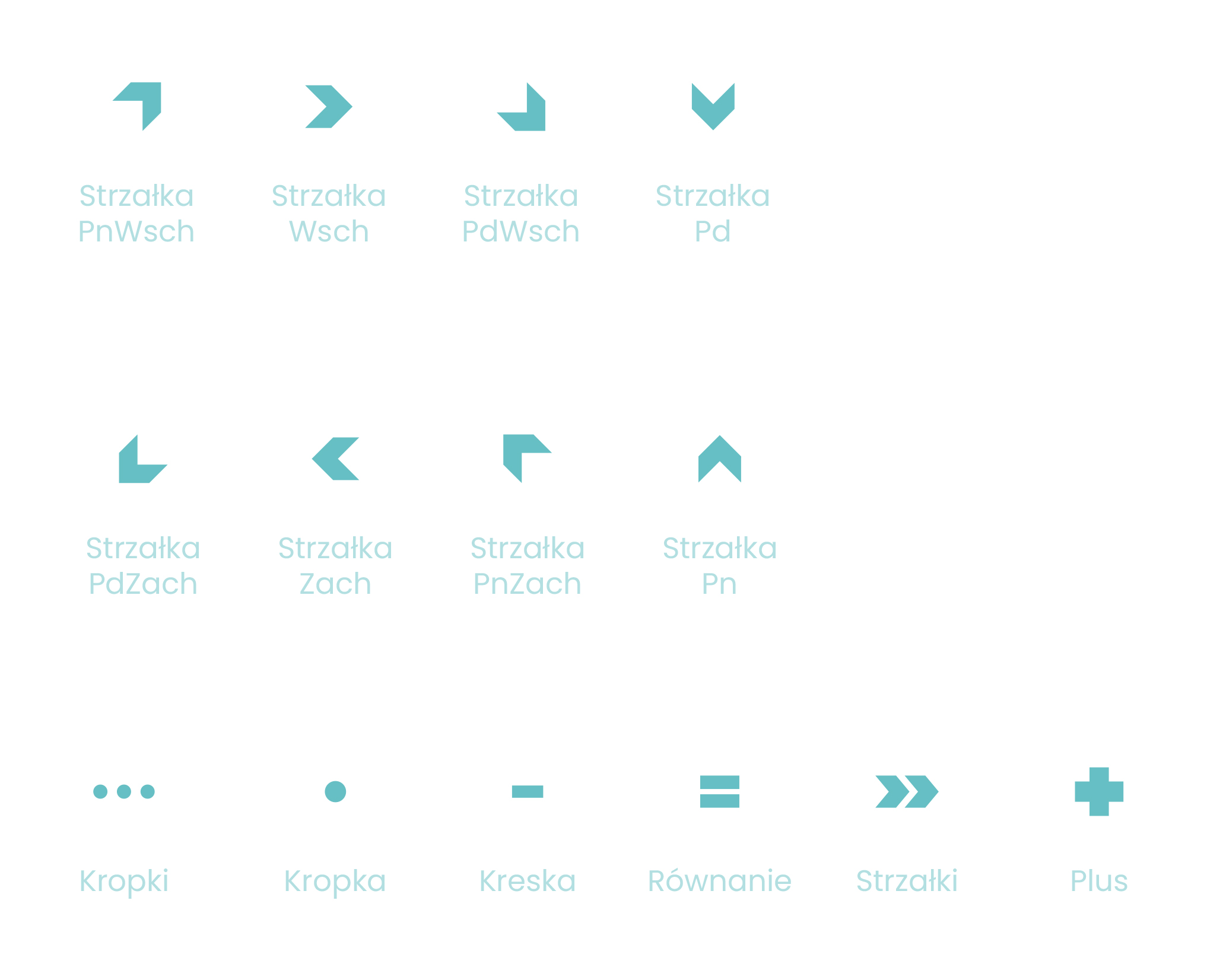
Brand graphic elements
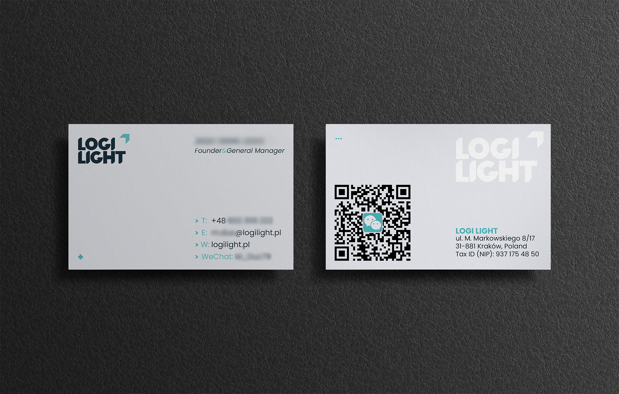
Business card
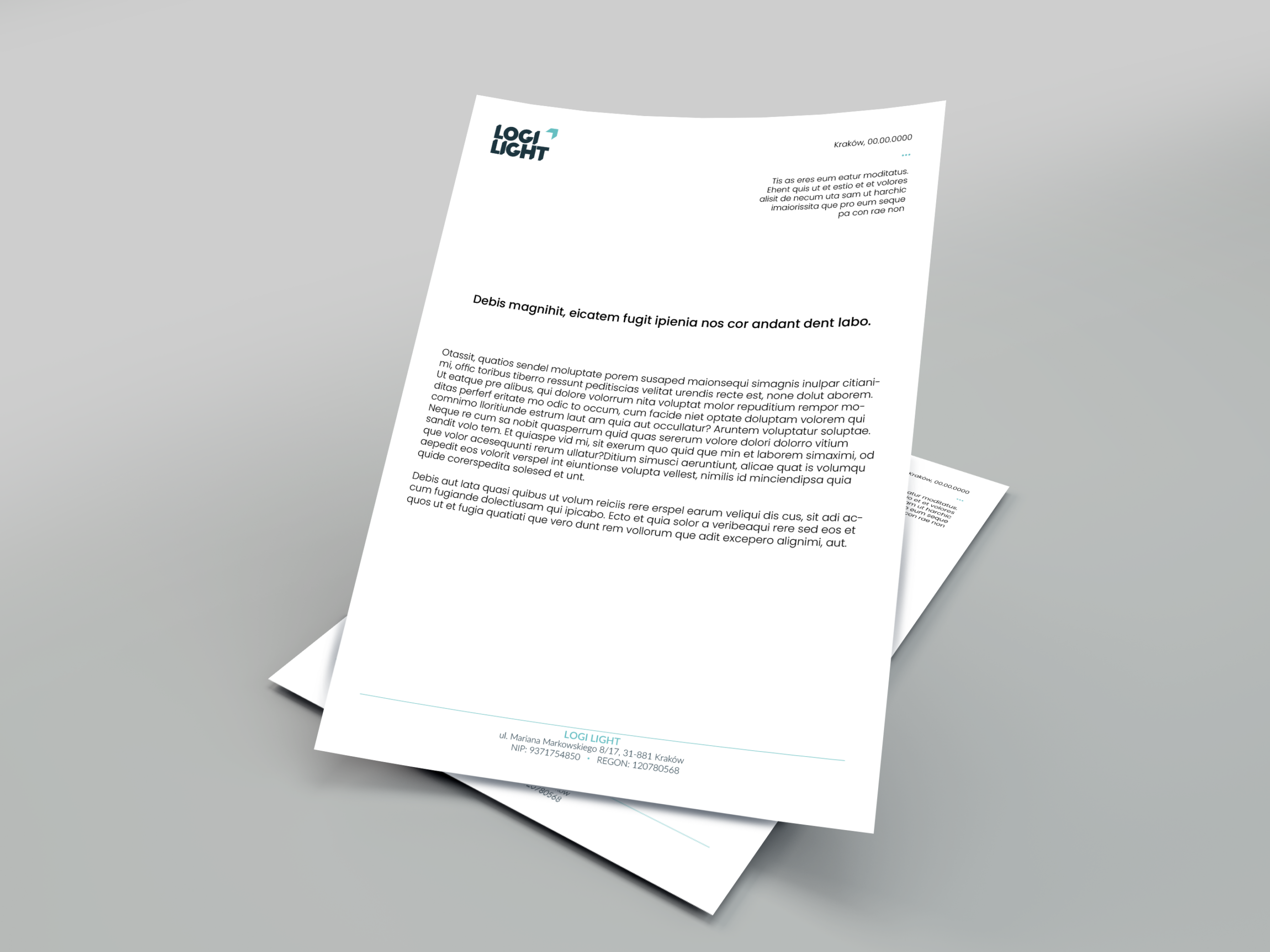
Letterhead