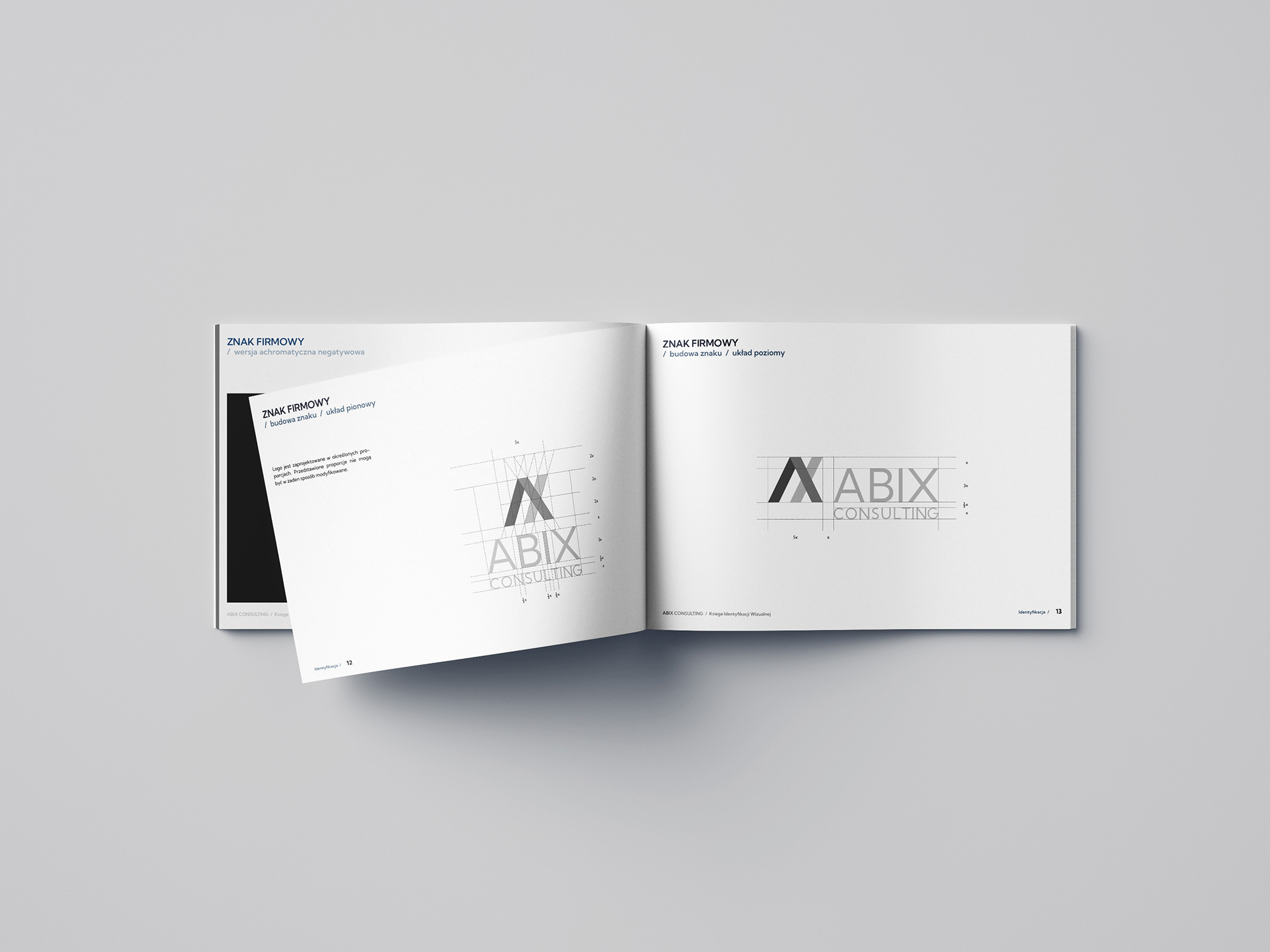
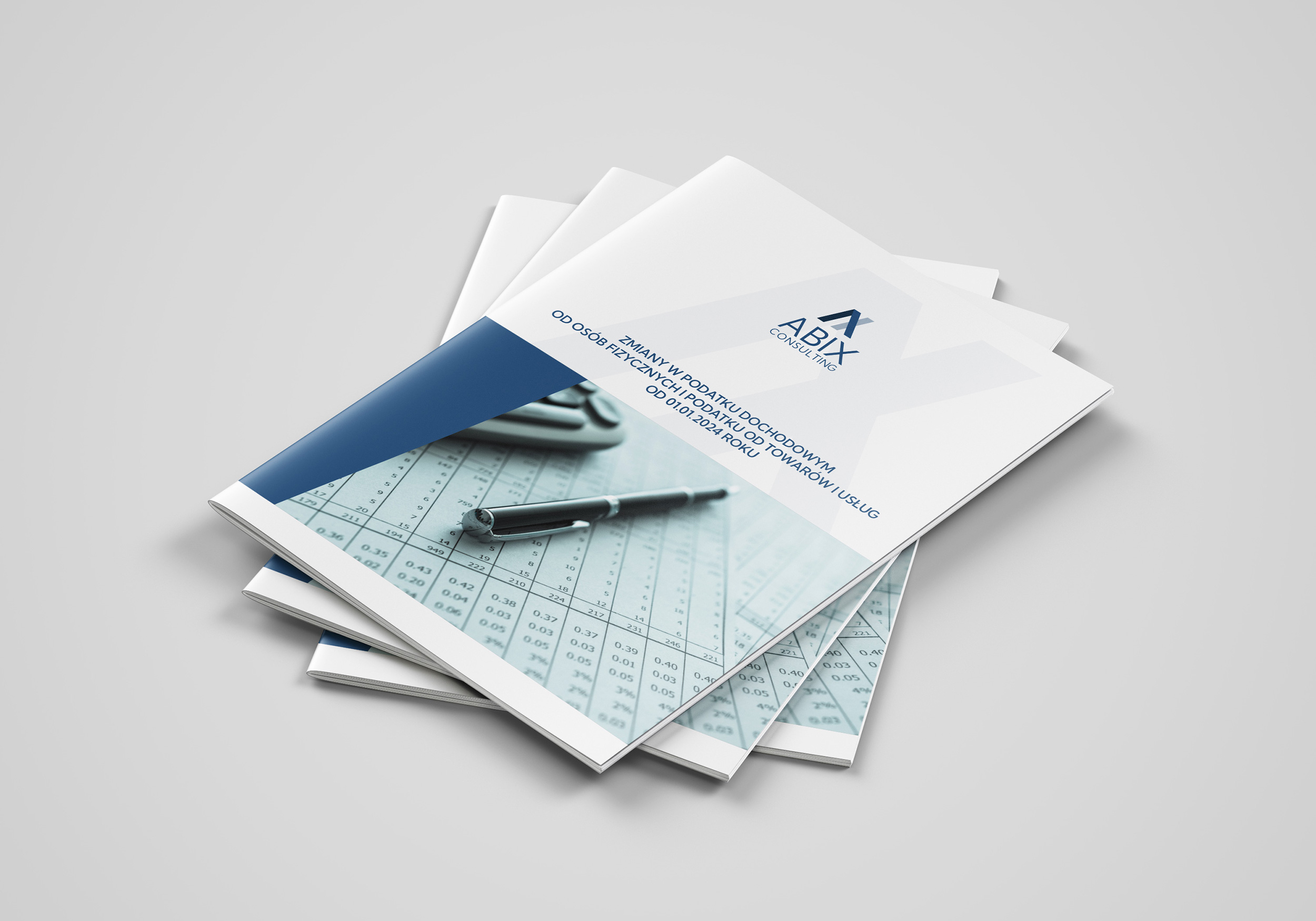
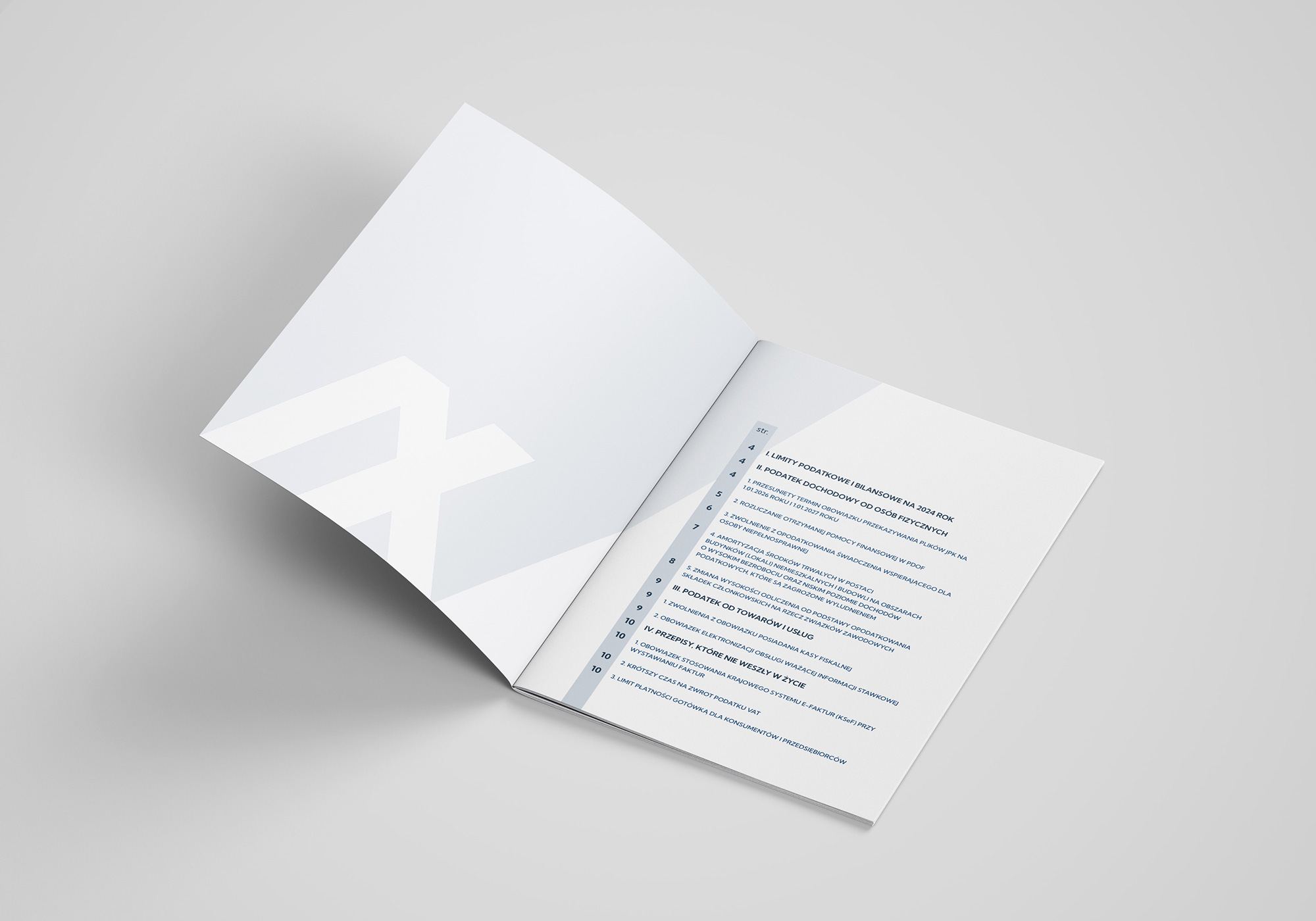
For Abix Consulting, I prepared a comprehensive refresh of the accounting office’s image, which aimed to adapt the brand to modern standards and customer expectations. The key element was changing the logo, which gained a modern and minimalist form.
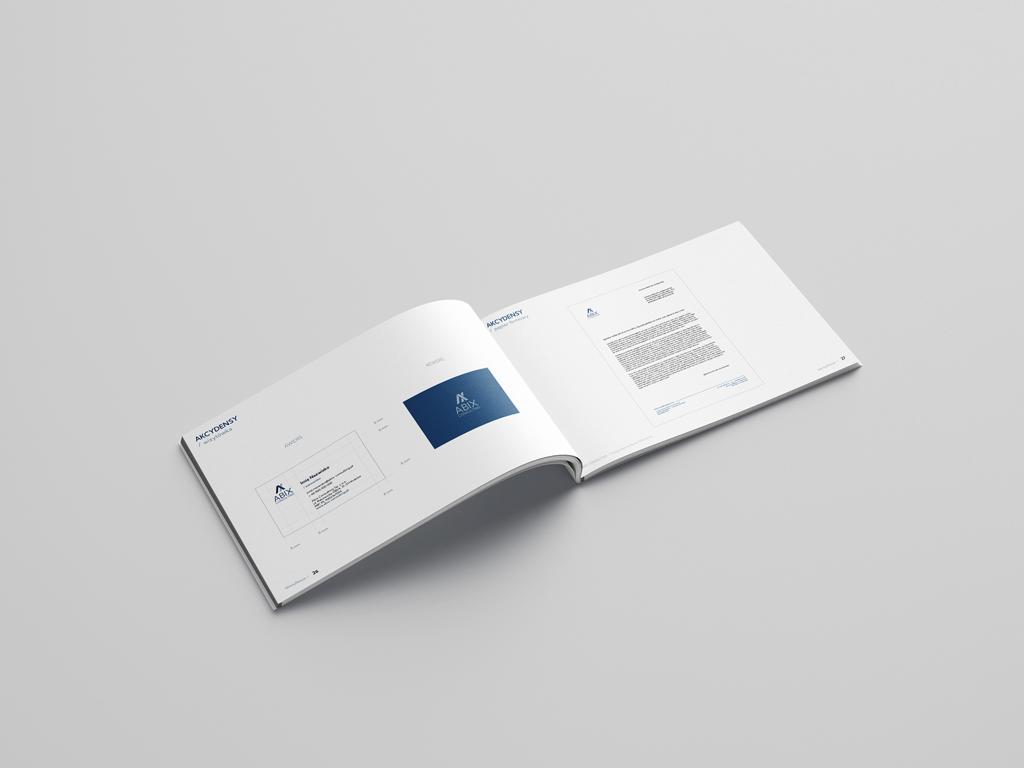
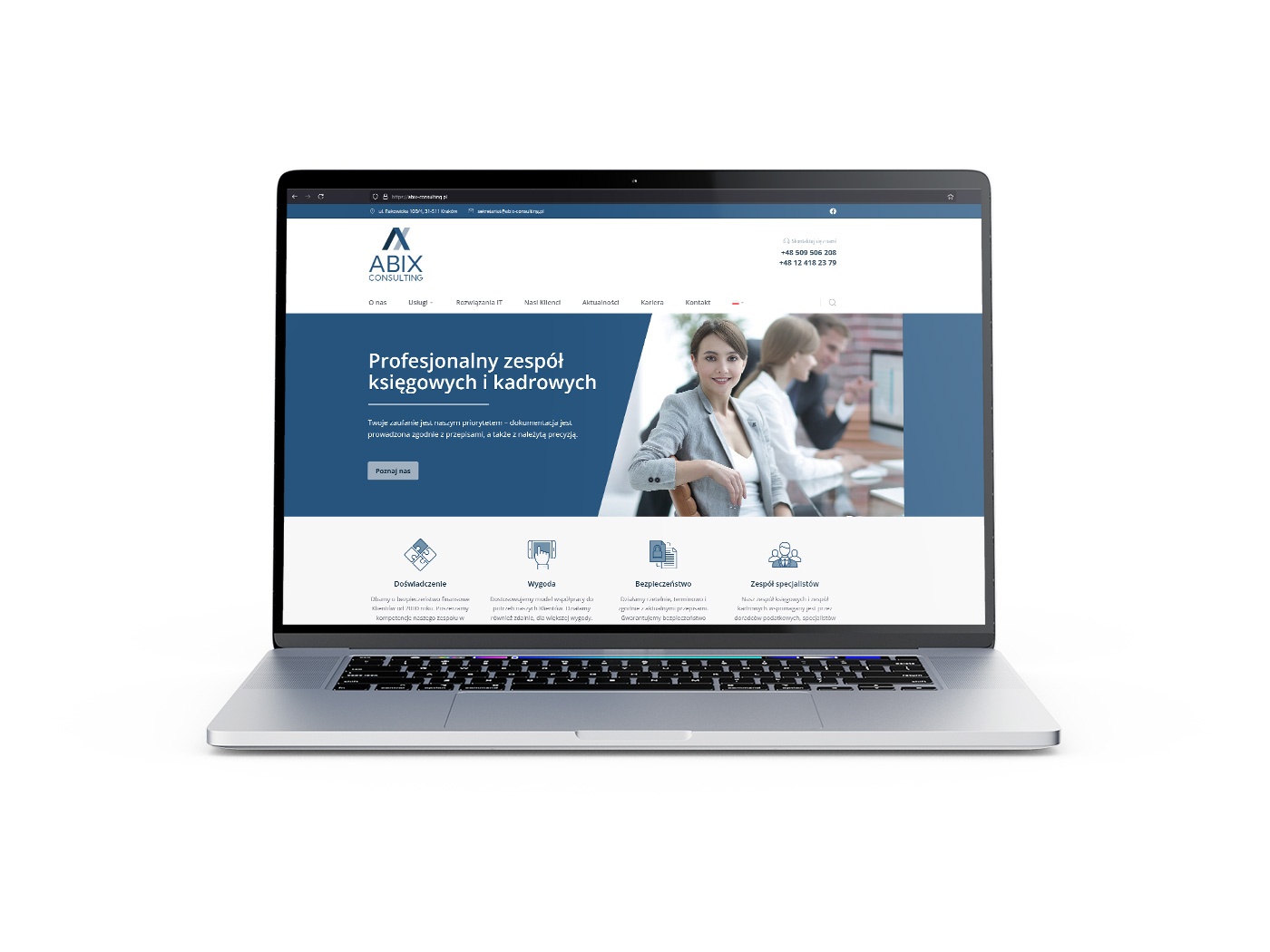
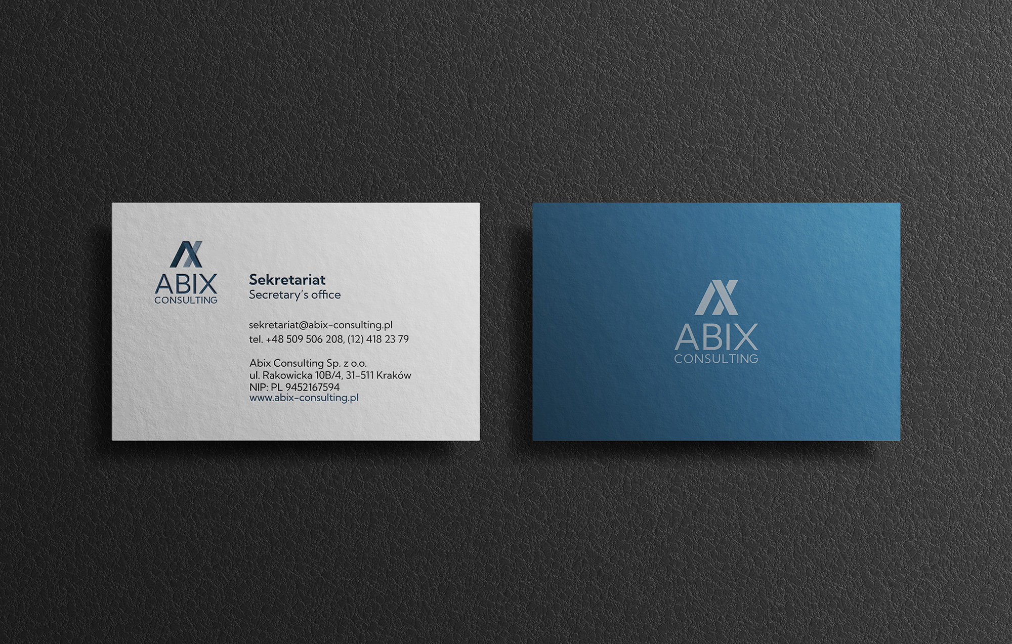
In addition to the logo, I also designed a new website, which is legible, intuitive and tailored to the needs of users. The website supports effective communication with customers and has been appropriately optimized for SEO to increase the company’s visibility on the web. For image consistency, I also created materials for the brand, such as business cards, leaflets and document templates. All elements perfectly match the new visual identification, emphasizing the professionalism of the office.
Thanks to this, refreshing the image of Abix Consulting allowed the company to stand out on the market and respond even better to the needs of its customers.
Design process
When designing the proposals presented below, I focused primarily on presenting the brand as modern, developing (which is very desirable in the financial industry, considering the number of constantly generated regulations), but at the same time stable, calm and trustworthy (after all, it has sensitive data about its clients’ companies). The designs avoid oddities that are incompatible with the seriousness of the activity and unnecessary complexity of the sign. I tried to create them clean and simple to understand.
In the case of graphic signs, the logos of companies dealing with finance in general are dominated by all kinds of charts, tables and books. On the one hand, I decided to try to avoid being like everyone else, but on the other hand, I decided to refer to it, because this is an industry in which excessive creativity and jumping out of line may not be very well received by customers, who prefer to entrust the handling of sensitive elements of their companies to stable hands.


