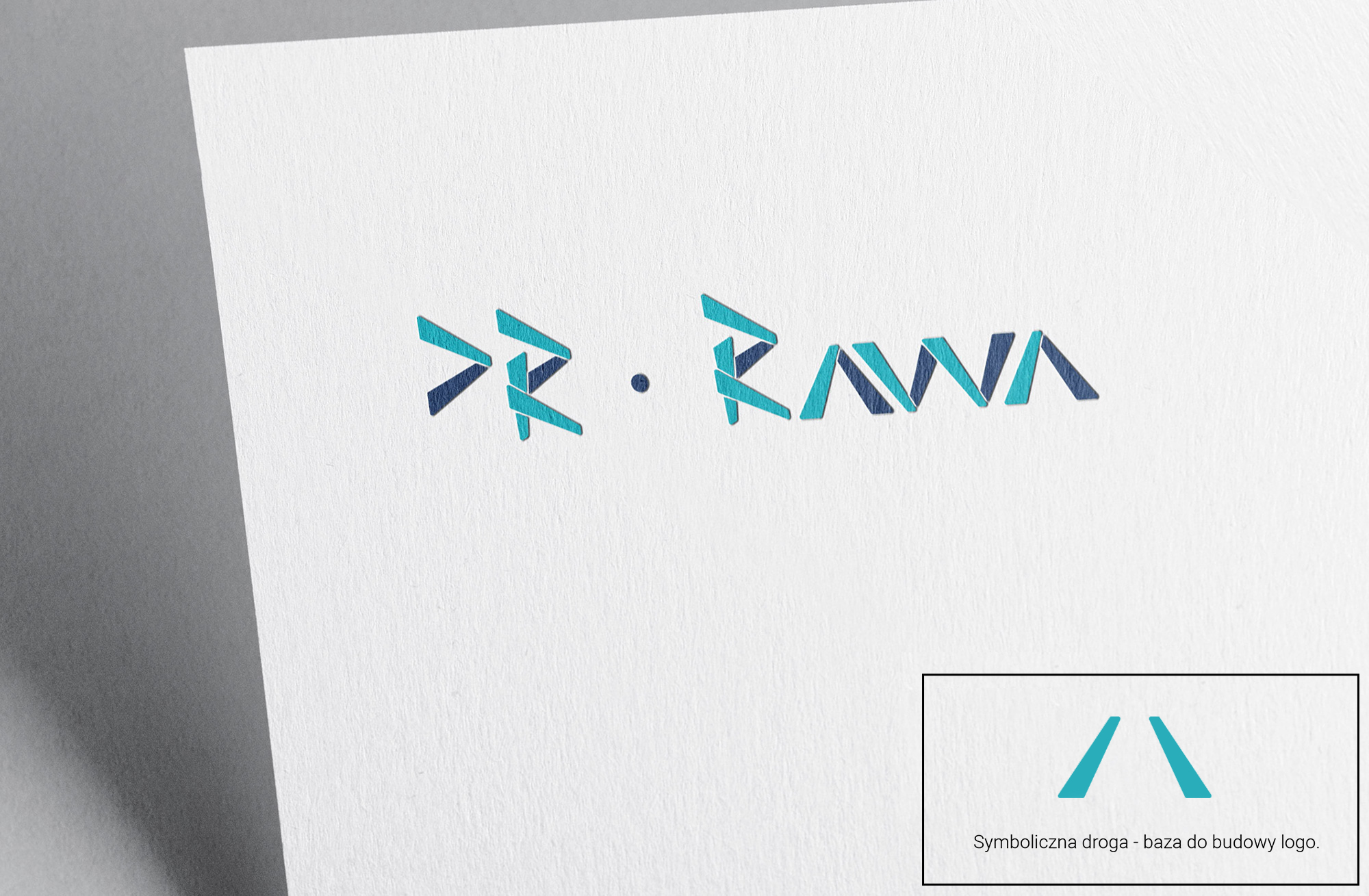
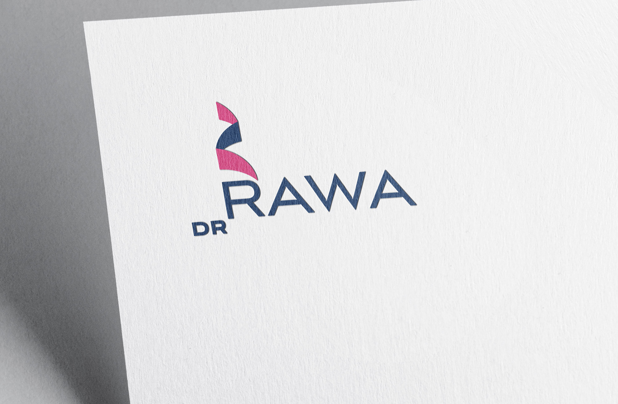
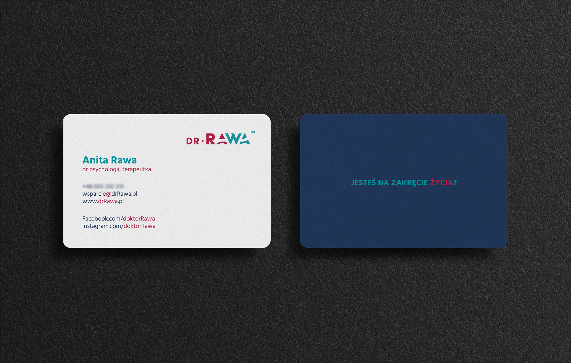
For the Solution Focused Therapy (TSR) clinic, I developed a comprehensive brand refresh, including a modern logo, business cards, and social media graphics. Each element of the design was designed to emphasize the clinic’s key values: journey, transformation, and development.
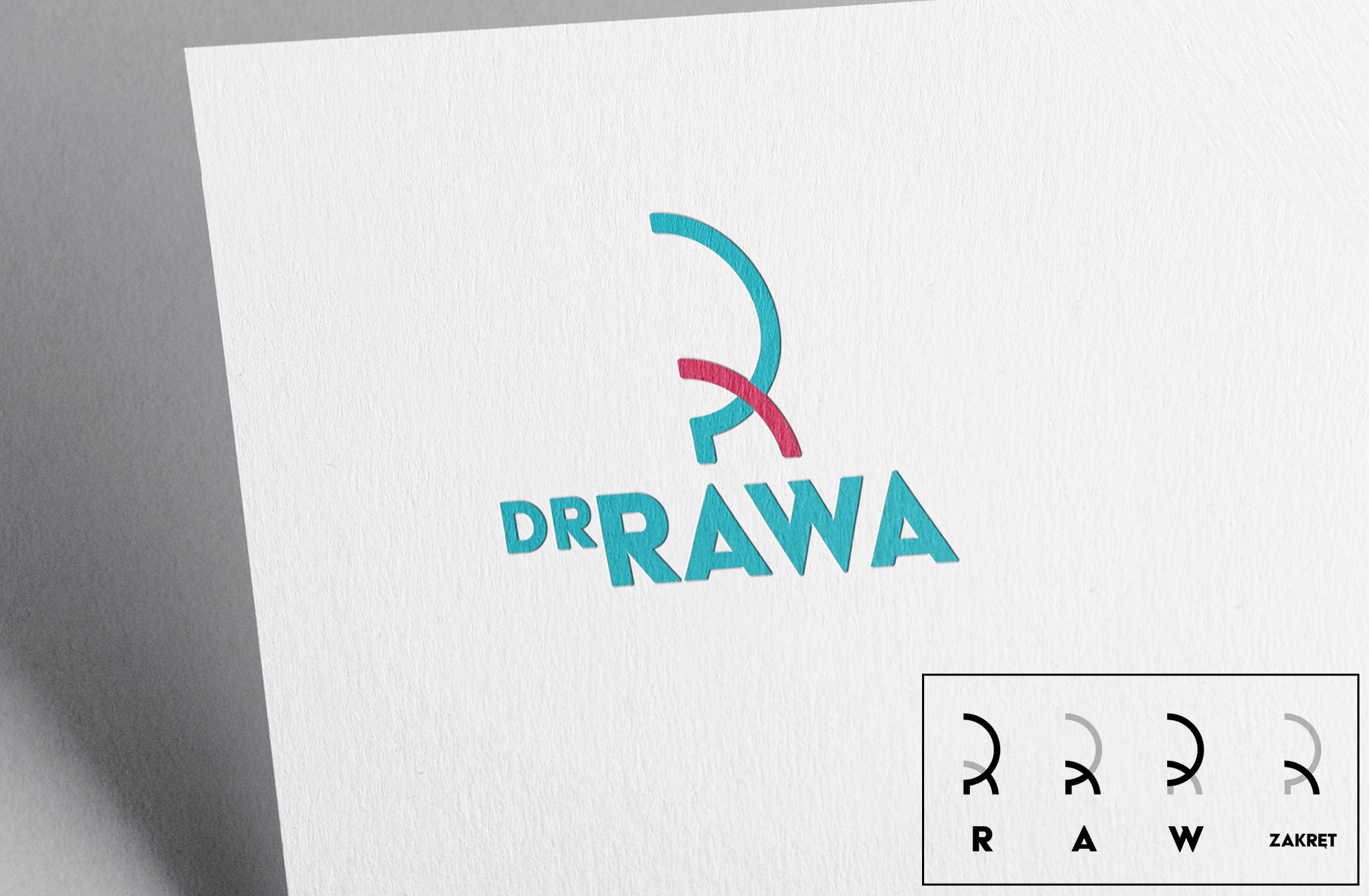
The new logo symbolically refers to the twists and turns in life that patients face, reflecting their process of getting back on track. Attention to aesthetics and visual consistency supports the clinic’s mission, which offers help to people who are at a turning point in their lives.

Design process
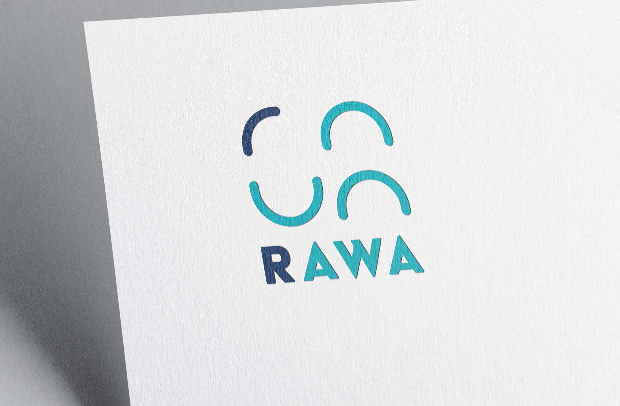
In the logo design process, I focused on the symbolism of the road, which perfectly reflects the essence of the TSR (Solution Focused Therapy) method – the process of transformation and searching for new directions. I used elements subtly reminiscent of a path or a bend, which are naturally associated with life change. Each option was designed to reflect the character of the office and support its mission of helping people at a turning point in life.
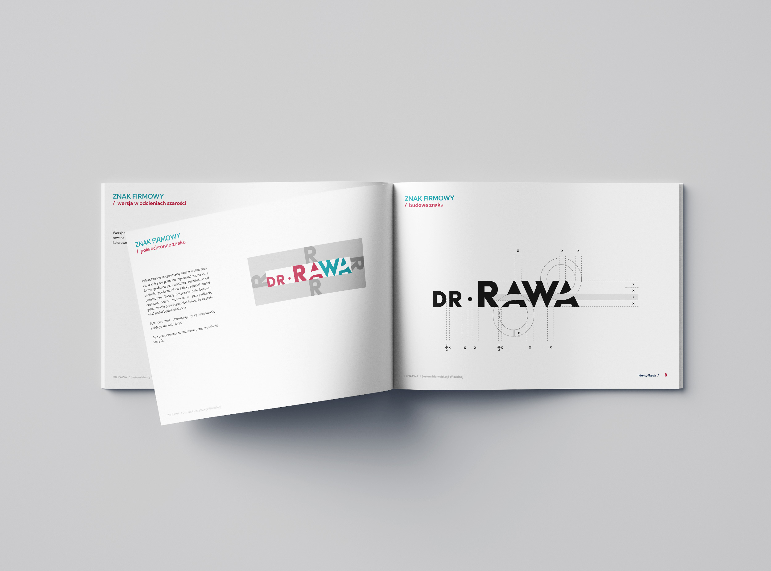
The final design is based on the symbolism of the path/bend inscribed in the typography, which subtly refers to the idea of the road, change and bend – a metaphor for the life challenges that the patients of the clinic face. It is a two-color composition, in which the first part uses Viva Magenta (the color of the year 2023), and the second changes to turquoise. The gradation of colors, combined with the motif of a bend and a path rising from the bottom to the top, symbolizes the process of the patient’s transformation – from difficult, negative experiences, represented by red, to harmony and healthy balance, expressed by shades of green.
