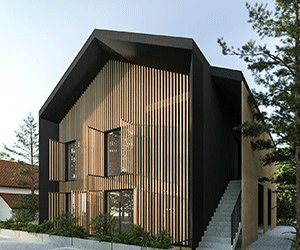
My task was to develop a full visual identity for luxury apartments built by Mobi Property, a developer from Krakow dealing with investments in the premium segment.
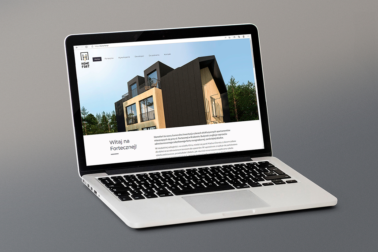
Additionally, I prepared a website and promotional materials.
Initial logo concepts
Below, I present logo suggestions from the initial stages of design. Everything revolved around forts, due to the name of the street where the investment is being built – Forteczna. Finally, a sign consisting of the letters H and F was created, using the serif typeface associated as a prestigious one. The letters are inscribed in a square with a cutout, symbolically referring to the plan of building classic forts – defensive structures.
In order to slightly modernize the logo, the logotype is created using a clean, technical typeface.
Visual identification system


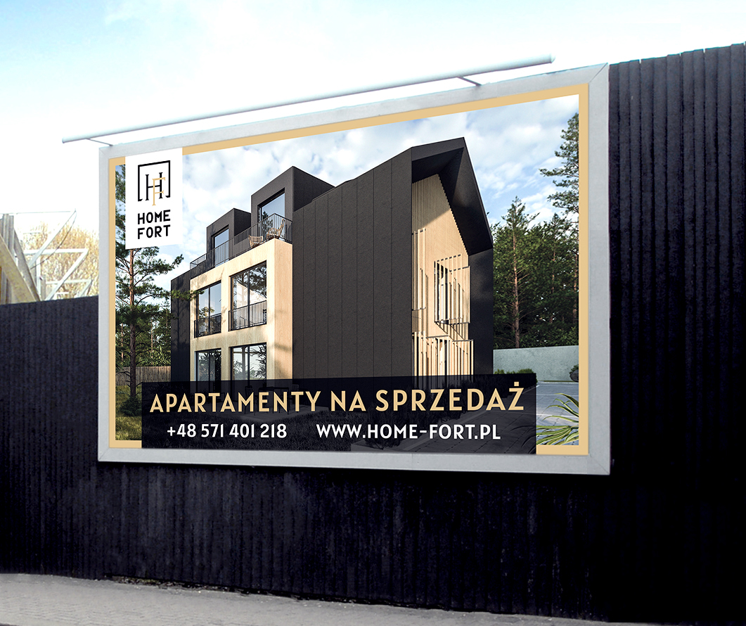
Billboard
Banner