The purpose of the order was to design a signet for the existing brand logo. The task was complicated as the client planned to legally claim the mark, and the problem with claiming the logo with Bakermann in its name was that it was a word too general and commonly used to be considered unique and peculiar to the brand. It had to be played with a graphic sign that should not be too much related to baking.
Together with the client, we focused on the imaging of other advantages of the brand – durability and high-quality products. Hence the reference to animals to which these features are attributed, or the letter B stylized as a diamond.
Initial projects


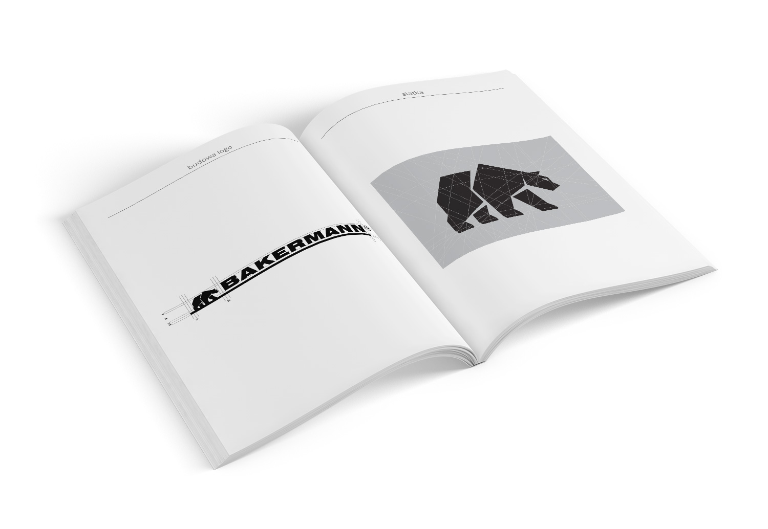
Manual
A manual was prepared for the project, containing the rules for building the logo.