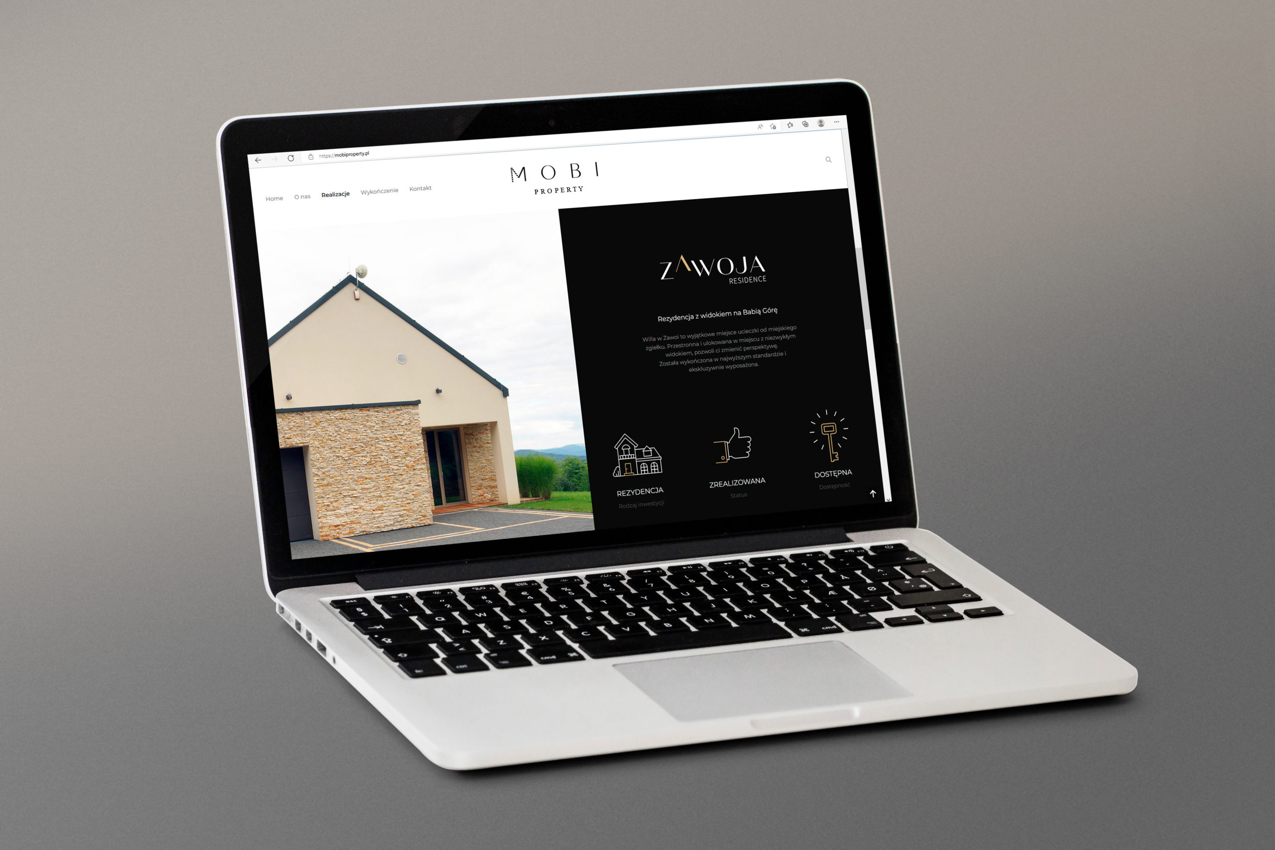
My task was to develop a full visual identity for the Mobi Property brand, a Krakow developer dealing with the construction and furnishing of apartments and residences from the premium segment. Additionally, I prepared a website and visual identification for all the developer’s investments.
Work progress
Analysis of the real estate industry shows that its favorite color is definitely blue – it is the most common color in the logos of leading brands in the world. No wonder, it is the color of trust, reliability and responsibility.
I chose two main colors: in addition to blue, I chose purple. Plus black as a spot color as well as golden accents.
Why violet? It is the color of the aristocracy. It is associated with power and greatness – just like red, but it has noble and soothing connotations. It is the color of success, wisdom and self-confidence. Black, on the other hand, is elegance and refinement. It is a popular companion of any color and accentuates it very well, and the use of golden accents gives the brands a sense of luxury and exclusivity.
In addition, black and gold are also common colors for other Mobi Property investments, also using them when creating a logo for the main brand makes its image consistent with other logos.
Initial logo concepts
In this proposal I put (as, to some extent, in every next one) on the so-called refined simplicity. Without unnecessary frills, the logo should be legible and clearly indicate that the brand is serious and deals with serious matters. The letter M, stylized on two roofs, accentuates the main area of the brand’s activity – real estate. In addition, the truncated letter I adds dynamics to the whole by inscribing the logo into a triangle.
In this variant, I moved away from the real estate theme and focused on the aspect of creation. The mark is being made, not ready yet. Here, what is not visible in the logo is also an element of this logo. The golden element in the center balances the logo and gives it a center of gravity.
In this case, we are moving away from rigid seriousness. Rounded shapes and a simple typeface are a tribute to modernity and development. The logo informs that the brand is innovative, has specialist knowledge and experience. So you can trust her. And as in the previous one, the golden element in the center balances the logo and gives it a center of gravity.
In this variant, I had a similar idea as in the previous project. The main philosophy is to approach Mobi as the mother brand. The circle symbolizes the entire “Mobi ecosystem”, which is made up of a number of sub-brands. For those who are already there and those that are yet to be created – each Mobi investment is a separate brand. Letters that are not placed centrally increase the dynamics of the sign. I focus on moving away from rigid seriousness, and the brand is modern, progressive and looking to the future.
The final look of the logo
The concept behind the creation of the logo for Mobi Property was to emphasize the most important aspect of the brand dealing with construction and interior design – participation in the creation process.
The logo was therefore conceived as itself undergoing this process, not yet completely finished and complete. It was designed as a simple, clean form, in which the aspects of modernity and exclusivity that are important for the brand are played out at the level of typography, while the modern typeface in the word MOBI is combined with the exclusive typeface in the word PROPERTY.
Visual identification system
Along with the logo for the brand, a book of visual identification was of course prepared.